2018-06-13
課程綱要
Agenda
- Data Visualization
ggplot2in R- 基本架構介紹
- 起手式(基本語法)
- 應用(各種圖形的呈現)
BarLineHistogramPointHeatmap
- 進階技巧
- 互動式視覺化呈現
- Bonus
Data Visualization
- 清晰有效地傳達與溝通訊息
- 教學、研究、宣傳
- 美學、功能兼顧
- 統計圖形、訊息可視化
- 一張好圖,勝過千言萬語

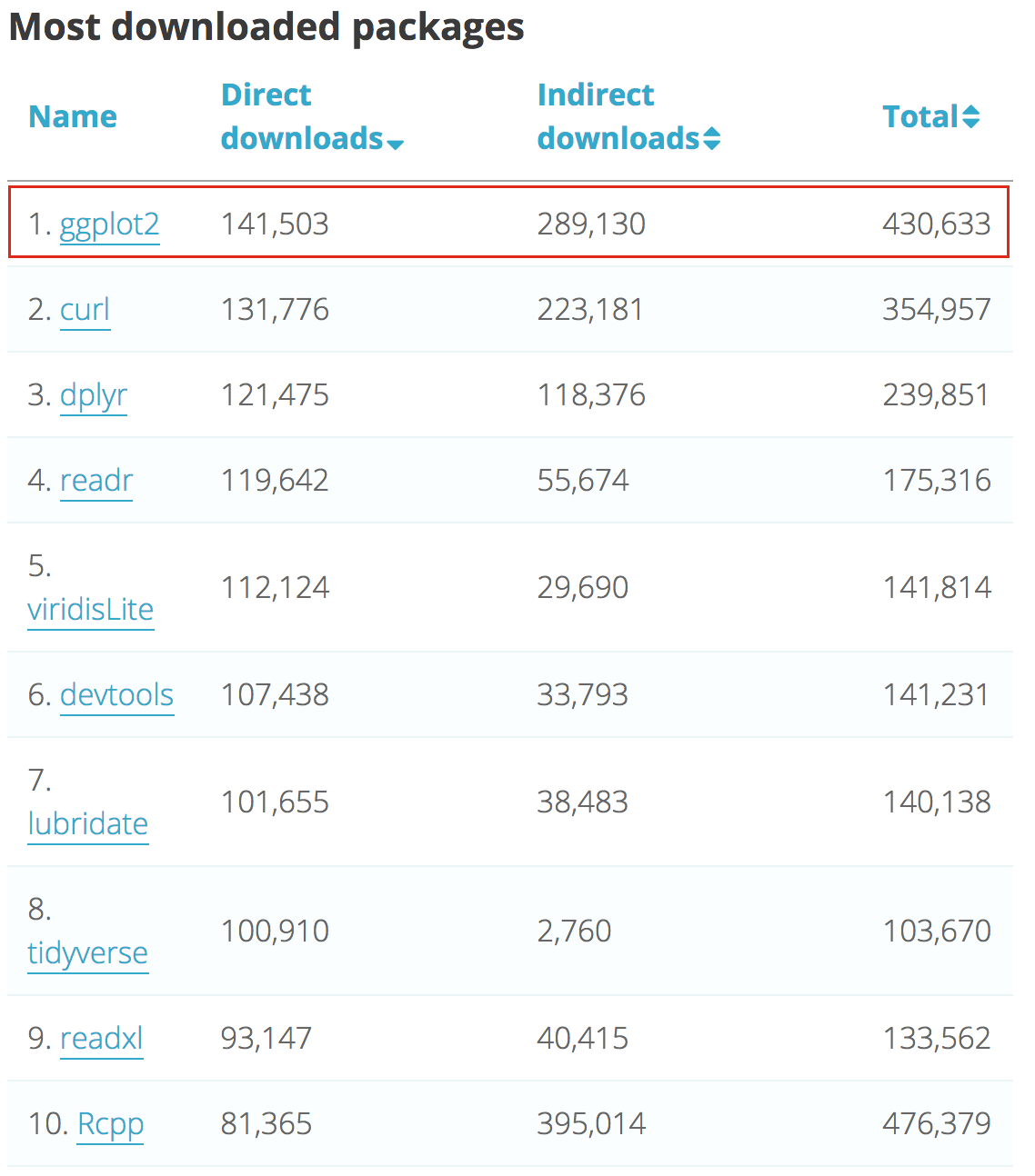
ggplot2 簡介
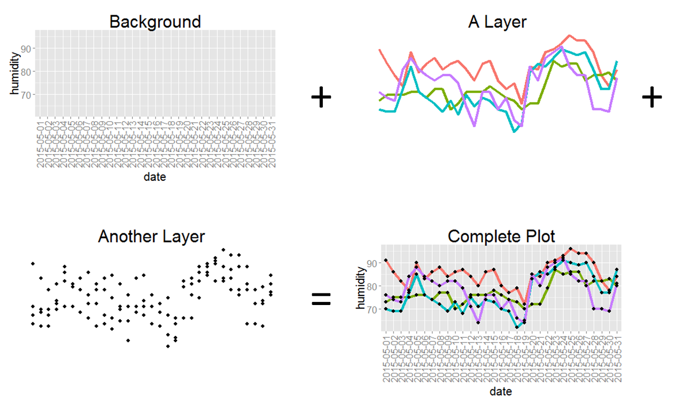
The Anatomy of a Plot
ggplot2 基本架構
- 資料 (data) 和映射 (mapping)
- 美學對應(
aesthetic) - 幾何圖案 (
geometric) - 座標尺度 (
scale) - 統計轉換 (
statistics) - 座標系統 (
coordinante) - 圖層 (layer)
- 繪圖面 (
facet) - 主題 (
theme)
ggplot2 基本架構(2)
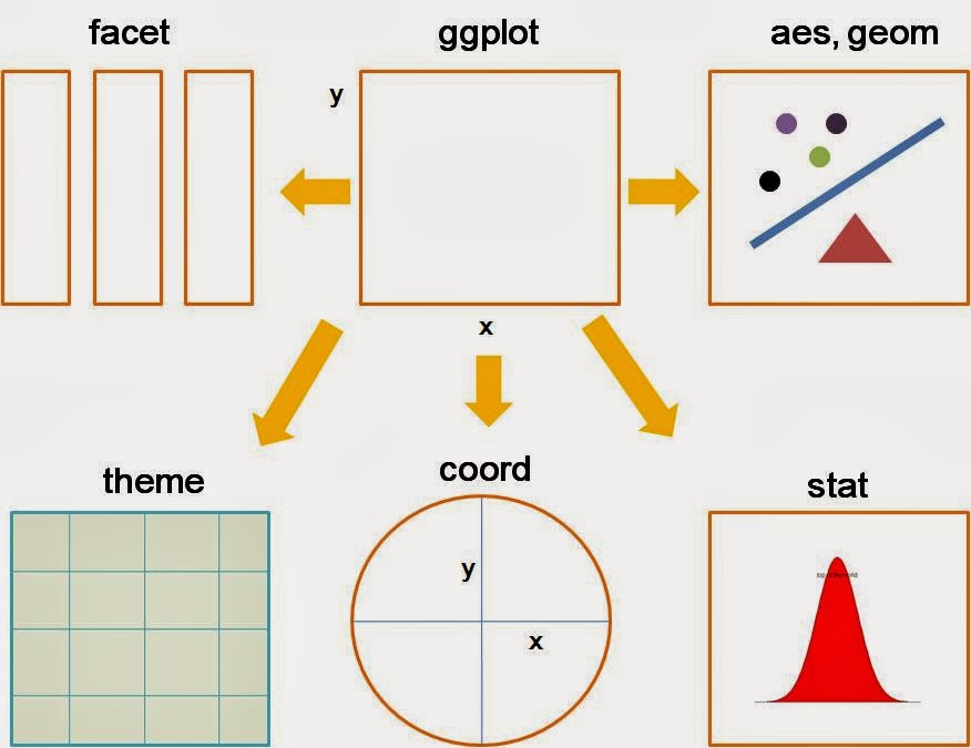 source: http://goo.gl/Odt2Rs
ggplot2 基本語法
ggplot(data=..., aes(x=..., y=...)) +
  geom_xxx(...) +
  stat_xxx(...) +
  facet_xxx(...) + ...
ggplot描述 data 從哪來aes描述圖上的元素跟 data 之類的對應關係geom_xxx描述要畫圖的類型及相關調整的參數- 常用的類型諸如:
geom_bar,geom_line,geom_points, …
圖層概念的實作
前菜 - ggplot2到底有多少種圖
Various functions
library(ggplot2)
# list all geom
ls(pattern = '^geom_', env = as.environment('package:ggplot2'))
 [1] "geom_abline"     "geom_area"       "geom_bar"
 [4] "geom_bin2d"      "geom_blank"      "geom_boxplot"
 [7] "geom_col"        "geom_contour"    "geom_count"
[10] "geom_crossbar"   "geom_curve"      "geom_density"
[13] "geom_density_2d" "geom_density2d"  "geom_dotplot"
[16] "geom_errorbar"   "geom_errorbarh"  "geom_freqpoly"
[19] "geom_hex"        "geom_histogram"  "geom_hline"
[22] "geom_jitter"     "geom_label"      "geom_line"
[25] "geom_linerange"  "geom_map"        "geom_path"
[28] "geom_point"      "geom_pointrange" "geom_polygon"
[31] "geom_qq"         "geom_quantile"   "geom_raster"
[34] "geom_rect"       "geom_ribbon"     "geom_rug"
[37] "geom_segment"    "geom_smooth"     "geom_spoke"
[40] "geom_step"       "geom_text"       "geom_tile"
[43] "geom_violin"     "geom_vline"
注意
- 使用
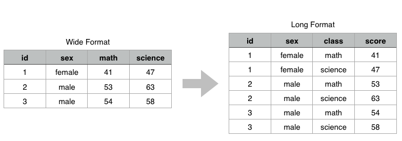
data.frame儲存資料 (不可以丟 matrix 物件) - 使用
wide formattolong format
正片開始
首先請先安裝以下套件
- 安裝套件
install.packages(c("tidyr","dplyr","ggplot2"))
- 載入套件 (注意:下載完套件一定要記得
library才能使用喲!)
library(ggplot2)
library(dplyr)
library(tidyr)
or
- 安裝套件
install.packages("tidyverse")
- 載入套件 (注意:下載完套件一定要記得
library才能使用喲!)
library(tidyverse)
一切從讀檔開始(CSV)
############### 相對路徑 ###############
# 瞭解現在我們所處在的路徑
getwd()
# 設定我們檔案存放的路徑
setwd()
# 讀檔起手式
data <- read.csv("transaction.csv")
# 若讀入的是亂碼,試試以下
data <- read.csv("transaction.csv",fileEncoding = 'big5')  #如果你是mac
data <- read.csv("transaction.csv",fileEncoding = 'utf-8') #如果你是windows
資料介紹
| district | price_total | build_ymd | build_type | trac_year | age |
|---|---|---|---|---|---|
| 士林區 | 6380000 | 701109 | 公寓(5樓含以下無電梯) | 102 | 32 |
| 中山區 | 12010000 | 701228 | 住宅大樓(11層含以上有電梯) | 102 | 32 |
| 中山區 | 10080000 | 970114 | 套房(1房1廳1衛) | 102 | 5 |
| 北投區 | 4600000 | 851218 | 住宅大樓(11層含以上有電梯) | 102 | 17 |
| 中山區 | 23800000 | 970624 | 華廈(10層含以下有電梯) | 102 | 5 |
欄位說明
| 英文欄位名稱 | 中文欄位名稱 |
|---|---|
| city | 縣市 |
| district | 鄉鎮市區 |
| trac_year | 交易年份 |
| trac_month | 交易月份 |
| trac_type | 交易標的 |
| trac_content | 交易筆棟數 |
| use_type | 使用分區或編定 |
| 英文欄位名稱 | 中文欄位名稱 |
|---|---|
| build_type | 建物型態 |
| build_ymd | 建築完成年月 |
| area_land | 土地移轉總面積.平方公尺. |
| area_build | 建物移轉總面積.平方公尺. |
| area_park | 車位移轉總面積.平方公尺. |
| price_total | 總價.元. |
| price_unit | 單價.元.平方公尺. |
以為開始了嗎?
- 進行分析前,先去了解資料的型態與特性
str(data)
'data.frame':   153598 obs. of  15 variables:
 $ city        : Factor w/ 4 levels "新北市","臺中市",..: 3 3 3 3 3 3 3 3 3 3 ...
 $ district    : Factor w/ 99 levels "三峽區","三民區",..: 26 7 7 19 7 19 19 22 22 12 ...
 $ trac_year   : int  102 102 102 102 102 102 102 102 102 102 ...
 $ trac_month  : Factor w/ 12 levels "1","2","3","4",..: 1 1 1 1 1 1 1 1 1 1 ...
 $ trac_type   : Factor w/ 2 levels "房地(土地+建物)",..: 1 1 2 1 1 2 2 2 2 2 ...
 $ trac_content: Factor w/ 327 levels "土地0建物0車位0",..: 57 57 58 57 57 62 62 58 64 167 ...
 $ use_type    : Factor w/ 5 levels "住","其他","商",..: 1 3 3 3 1 1 1 1 4 1 ...
 $ build_type  : Factor w/ 12 levels "住宅大樓(11層含以上有電梯)",..: 3 1 5 1 9 9 9 1 10 1 ...
 $ build_ymd   : int  701109 701228 970114 851218 970624 1010724 1010724 1000414 1010531 870910 ...
 $ area_land   : num  34.96 10.71 8.51 4.7 30.97 ...
 $ area_build  : num  60.6 104.5 51.9 39.4 185.2 ...
 $ area_park   : num  0 0 8.55 0 0 ...
 $ price_total : num  6380000 12010000 10080000 4600000 23800000 ...
 $ price_unit  : int  105263 114928 194070 116900 128510 218147 204716 174613 133648 27658 ...
 $ age         : int  32 32 5 17 5 1 1 2 1 15 ...
身為資料分析師,一定要有的好習慣!
- 暸解基本的各變數統計量值
summary(data)
     city          district        trac_year     trac_month
 新北市:57418   淡水區 :  7172   Min.   :102   12     :15206
 臺中市:37482   西屯區 :  5974   1st Qu.:102   5      :15079
 臺北市:24238   新莊區 :  5955   Median :102   4      :14682
 高雄市:34460   北屯區 :  5881   Mean   :102   3      :14523
                新店區 :  5873   3rd Qu.:102   7      :13805
                中和區 :  5719   Max.   :102   6      :13392
                (Other):117024                 (Other):66911
                trac_type              trac_content   use_type
 房地(土地+建物)     :91613   土地1建物1車位0:66792   住  :115377
 房地(土地+建物)+車位:61985   土地1建物1車位1:41031   其他:  8206
                              土地2建物1車位0:14537   商  : 26205
                              土地1建物1車位2: 7195   工  :  3233
                              土地2建物1車位1: 4787   農  :   577
                              土地3建物1車位0: 4691
                              (Other)        :14565
                      build_type      build_ymd         area_land
 住宅大樓(11層含以上有電梯):70725   Min.   : 100602   Min.   :     0
 公寓(5樓含以下無電梯)     :23211   1st Qu.: 780326   1st Qu.:    13
 透天厝                    :21954   Median : 870506   Median :    22
 華廈(10層含以下有電梯)    :20365   Mean   : 868754   Mean   :    42
 套房(1房1廳1衛)           : 9709   3rd Qu.: 991201   3rd Qu.:    36
 店面(店鋪)                : 2888   Max.   :1030313   Max.   :127088
 (Other)                   : 4746
   area_build      area_park        price_total           price_unit
 Min.   :    0   Min.   :      0   Min.   :         0   Min.   :      0
 1st Qu.:   85   1st Qu.:      0   1st Qu.:   4900000   1st Qu.:  42685
 Median :  124   Median :      0   Median :   8400000   Median :  67880
 Mean   :  153   Mean   :     25   Mean   :  12879580   Mean   :  86176
 3rd Qu.:  179   3rd Qu.:      9   3rd Qu.:  14580000   3rd Qu.: 111173
 Max.   :79669   Max.   :2400000   Max.   :8800000000   Max.   :4284119
                                                        NA's   :461
      age
 Min.   :-1
 1st Qu.: 3
 Median :15
 Mean   :15
 3rd Qu.:24
 Max.   :92
質化 v.s. 量化:Bar Chart
geom_bar
- 先來
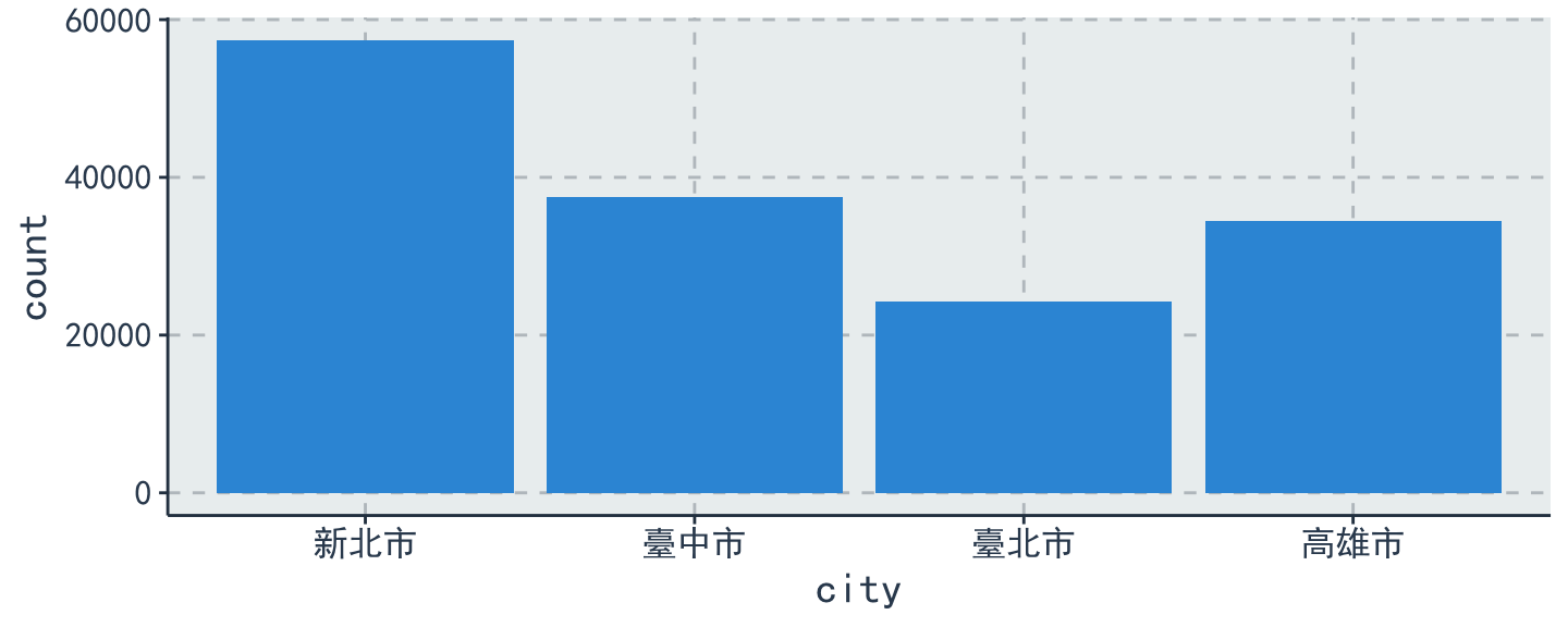
比較看看2013年在各縣市的案件交易量 - SimHei字體下載連結
thm <- function() theme(text = element_text(size = 15, family = "SimHei")) # 控制字體與大小
    # SimHei是只有Mac才有的字體, 用來解決Mac系統中文顯示錯誤的問題
    # Windows系統使用者請忽略 `+ thm()` 指令
data %>%
  ggplot(aes(x = city)) + geom_bar(stat = "count") + thm() # stat = "count" 算個數
Change labels !
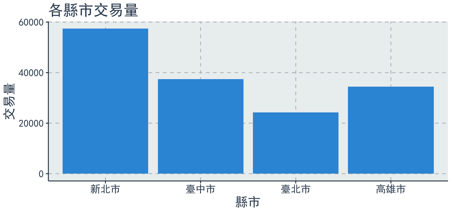
data %>%
  ggplot(aes(x = city)) + geom_bar(stat = "count") + thm() +
  labs(title = "各縣市交易量", x = "縣市", y = "交易量") # lab用來幫圖形的標題、x軸與y軸做命名
Change colors !
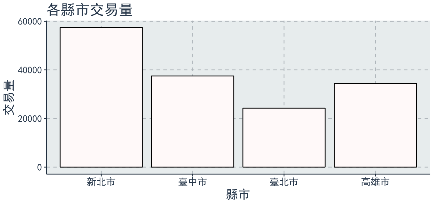
- 顏色調整:
colorvsfill?
data %>%
  ggplot(aes(x = city)) + geom_bar(stat = "count") + thm() +
  labs(title = "各縣市交易量", x = "縣市", y = "交易量") +
  geom_bar(fill = 'snow', color = 'black') # see colors() if you're picky
Bar chart
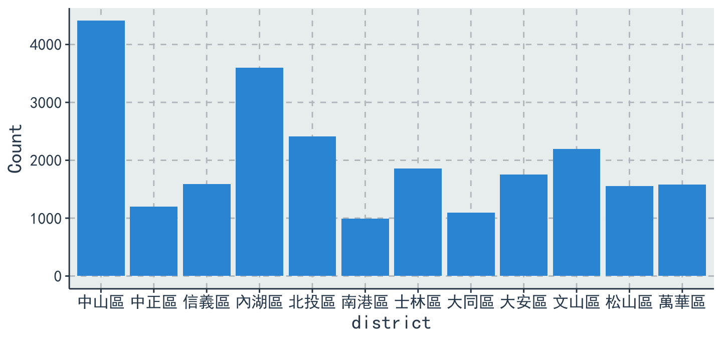
比較臺北市各行政區的案件交易量
# 資料整理
table = data %>%
  filter(city == "臺北市") %>%
  group_by(district) %>%
  summarise(Count = n())  # dplyr::n 用來計數
table
# A tibble: 12 x 2
   district Count
     <fctr> <int>
 1   中山區  4410
 2   中正區  1197
 3   信義區  1585
 4   內湖區  3598
 5   北投區  2416
 6   南港區   989
 7   士林區  1859
 8   大同區  1092
 9   大安區  1755
10   文山區  2197
11   松山區  1556
12   萬華區  1584
Bar chart
table %>%
  ggplot(aes(x = district, y = Count)) +
  geom_bar(stat = "identity") + thm() # stat='identity'以表格的值做為bar的高度
Reoder x
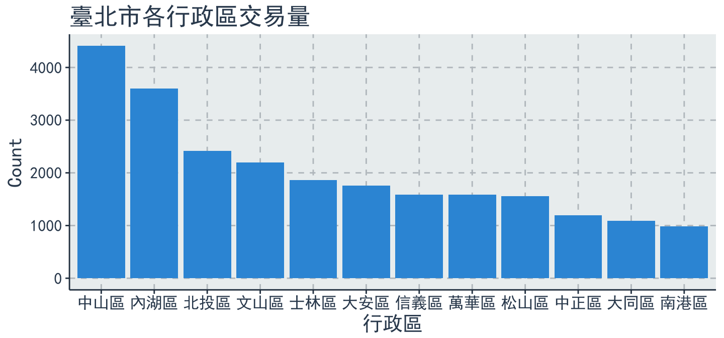
table %>%
  ggplot(aes(x = reorder(district, -Count), y = Count)) +
  geom_bar(stat = 'identity') + thm() +
  labs(titles = "臺北市各行政區交易量", x = "行政區", y = "Count")
小挑戰
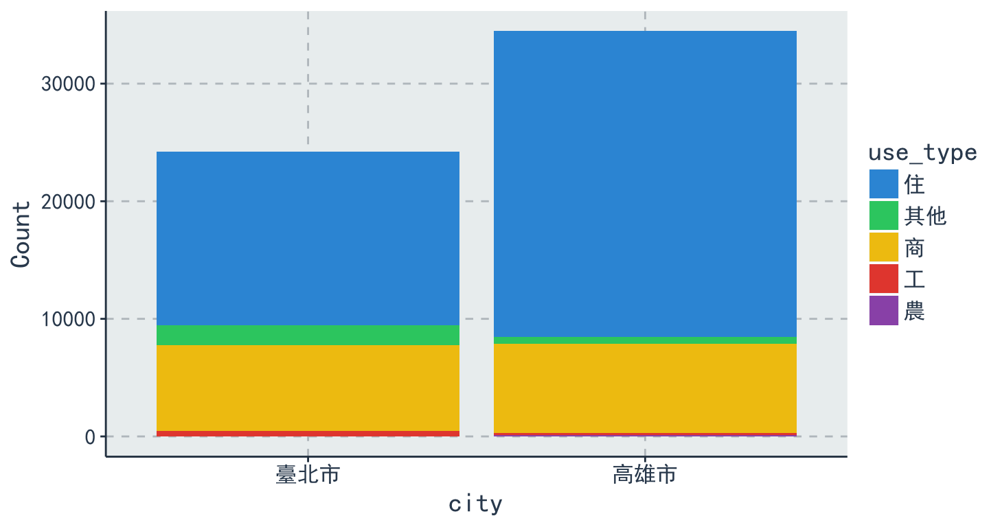
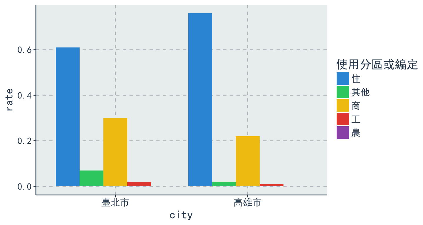
- 計算並
比較臺北市&高雄市的各使用分區或編定(use_type)所佔比例
# A tibble: 10 x 4
# Groups:   city [2]
     city use_type Count  rate
   <fctr>   <fctr> <int> <dbl>
 1 臺北市       住 14761  0.61
 2 臺北市     其他  1709  0.07
 3 臺北市       商  7323  0.30
 4 臺北市       工   442  0.02
 5 臺北市       農     3  0.00
 6 高雄市       住 26027  0.76
 7 高雄市     其他   532  0.02
 8 高雄市       商  7582  0.22
 9 高雄市       工   196  0.01
10 高雄市       農   123  0.00
參考解答
table = data %>%
  filter(city == "臺北市" | city == "高雄市" ) %>%
  group_by(city, use_type) %>%
  summarise(Count = n()) %>%
  mutate(rate = round(Count/sum(Count), 2))

Grouping:stack
table %>%
  ggplot(aes(x = city, y = Count, fill = use_type)) +
  geom_bar(stat = 'identity', position = 'stack') + thm() # stack類別堆疊
Grouping:dodge
table %>%
  ggplot(aes(x = city, y = rate, fill = use_type)) +
  geom_bar(stat = 'identity', position = 'dodge')  + # dodge類別並排
  thm() + scale_fill_discrete(name  ="使用分區或編定")  # 設定圖例的顯示
量化 v.s. 量化:Line Chart
geom_line
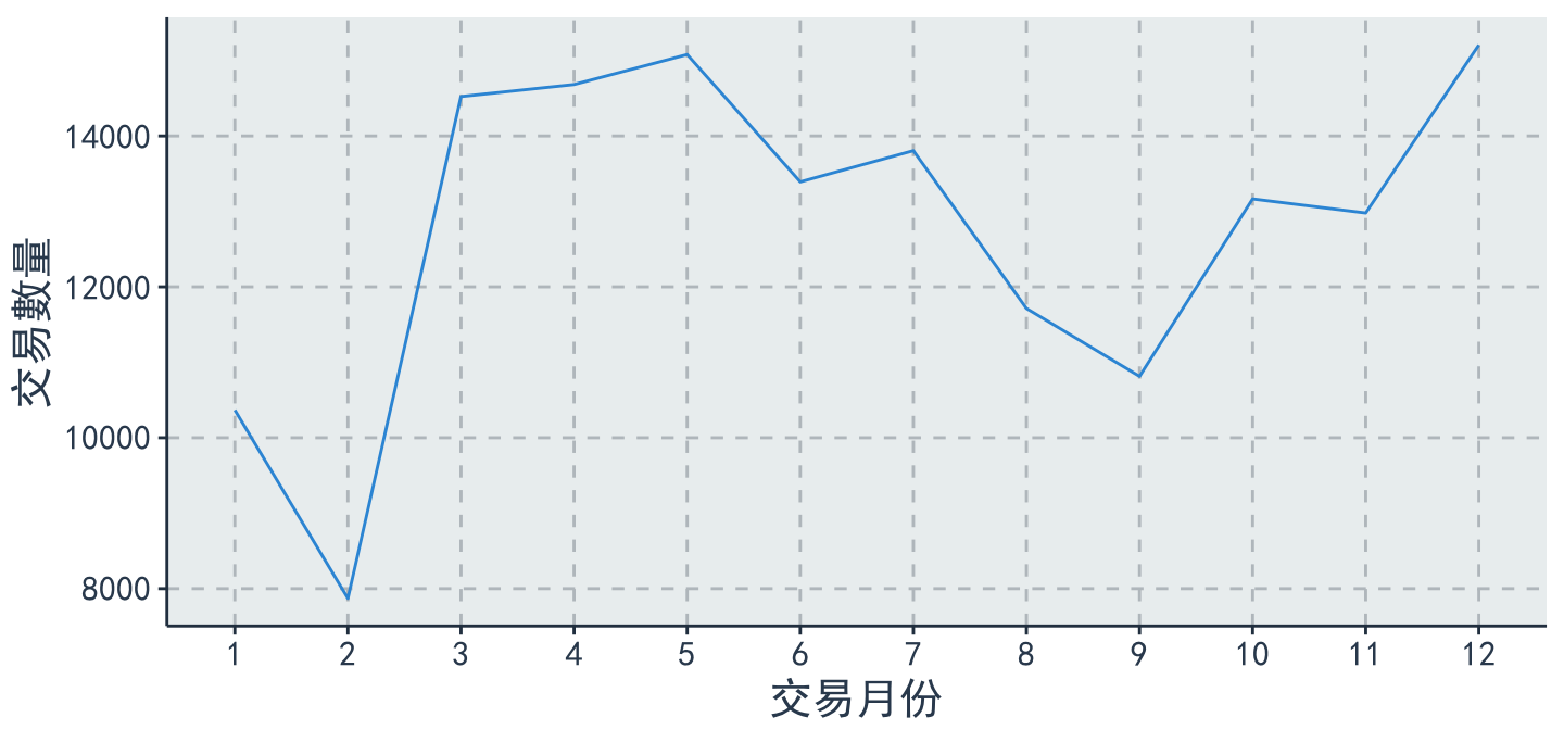
- 各月份交易量
table = data %>%
  group_by(trac_month) %>%
  summarise(Count=n())
table
# A tibble: 12 x 2
   trac_month Count
       <fctr> <int>
 1          1 10367
 2          2  7871
 3          3 14523
 4          4 14682
 5          5 15079
 6          6 13392
 7          7 13805
 8          8 11714
 9          9 10814
10         10 13166
11         11 12979
12         12 15206
Line chart
table %>%
  ggplot(aes(x = trac_month, y = Count, group = 1)) +
  geom_line() + thm() + labs(x = "交易月份" , y = "交易數量")
Multiple Line
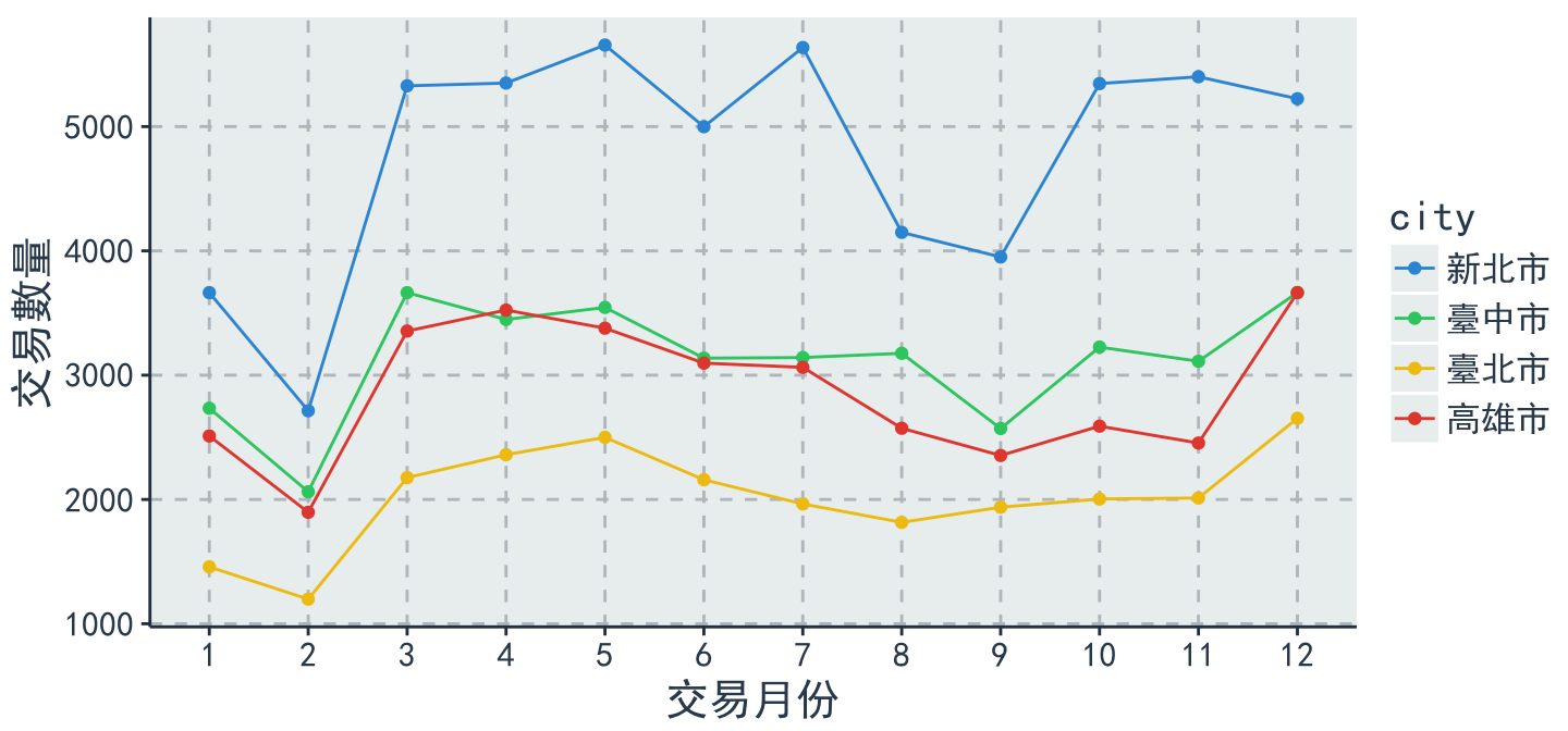
- 各縣市各月份交易量比較
table = data %>%
  group_by(city, trac_month) %>%
  summarise(Count = n())
table
# A tibble: 48 x 3
# Groups:   city [?]
     city trac_month Count
   <fctr>     <fctr> <int>
 1 新北市          1  3664
 2 新北市          2  2714
 3 新北市          3  5328
 4 新北市          4  5350
 5 新北市          5  5656
 6 新北市          6  4999
 7 新北市          7  5636
 8 新北市          8  4149
 9 新北市          9  3951
10 新北市         10  5346
# ... with 38 more rows
Multiple Line
table %>%
  ggplot(aes(x = trac_month, y = Count, group = city, color = city)) +
  geom_line() + geom_point() + thm() +
  labs(x = "交易月份" , y = "交易數量")
小挑戰
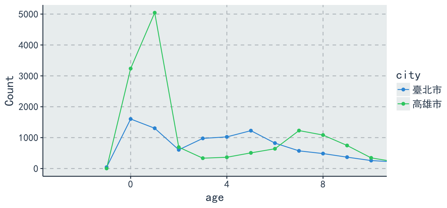
- 計算臺北市&高雄市不同屋齡的交易量,並畫出
MultipleLine plot - 如下圖:
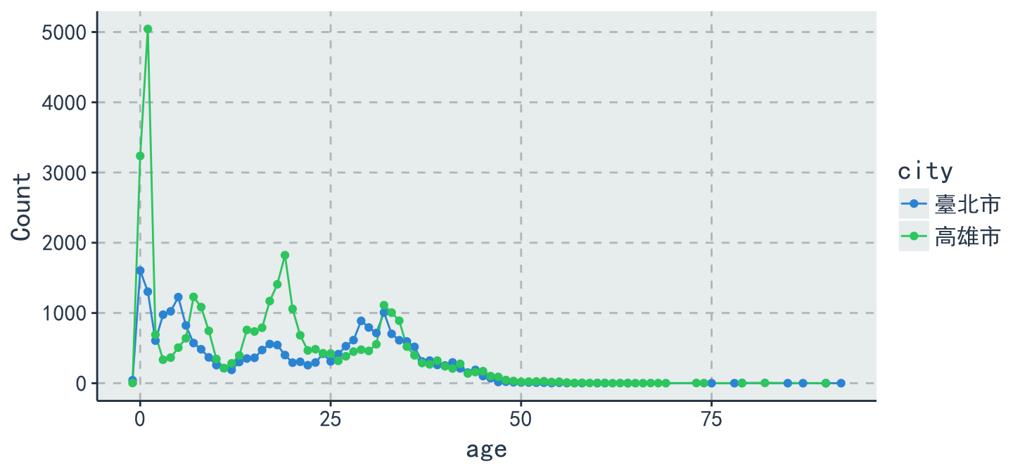
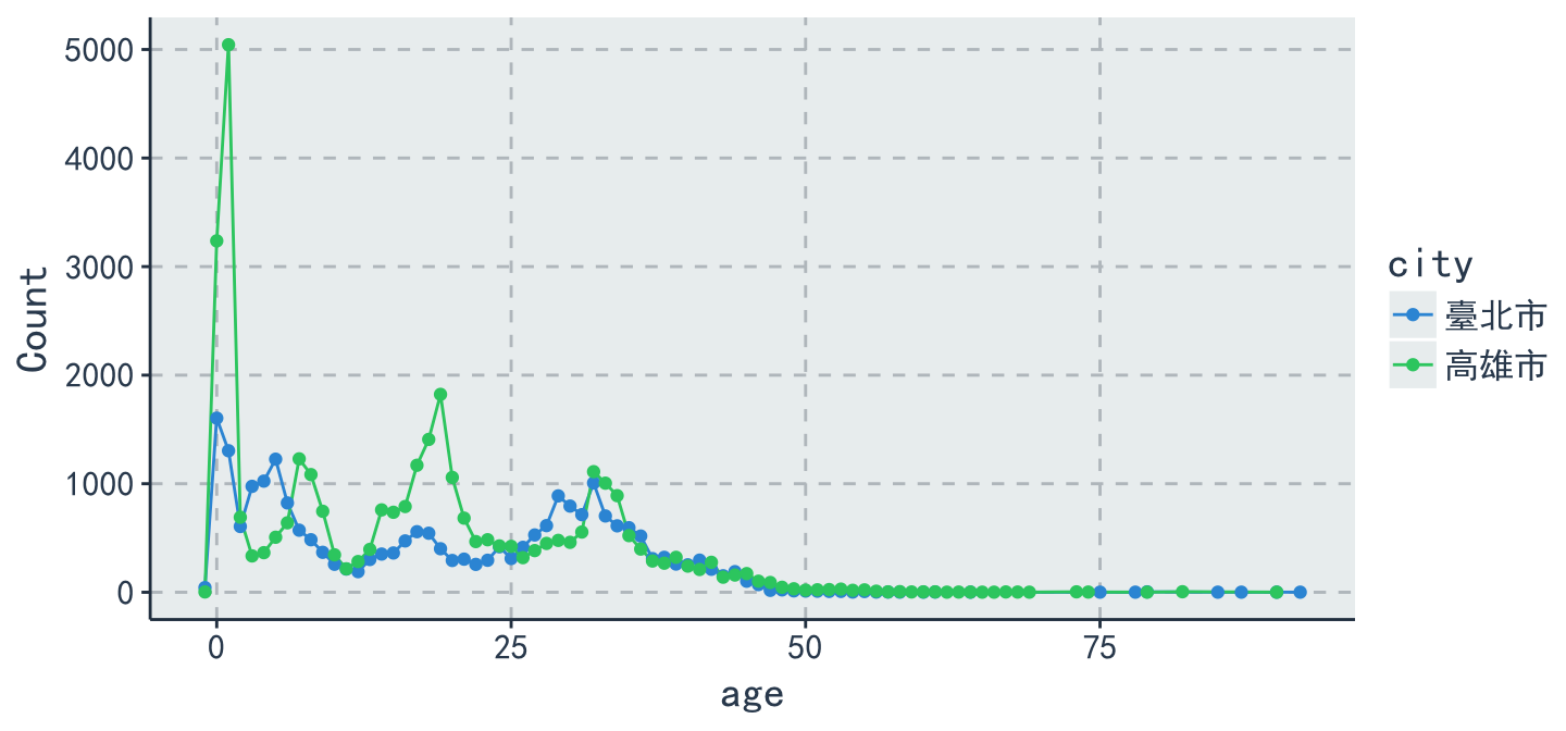
參考答案 (有發現什麼問題嗎?!)
data %>%
  filter(city == "臺北市" | city == "高雄市" ) %>%
  group_by(city, age) %>%
  summarise(Count = n()) %>%
  ggplot(aes(x = age, y = Count, group = city, color = city)) +
  geom_line() + geom_point() + thm()
調整 x 軸的 scale 再看一次
- EDA的價值之一就是找出資料中的
不合理
data %>%
  filter(city == "臺北市" | city == "高雄市" ) %>%
  group_by(city, age) %>%
  summarise(Count = n()) %>%
  ggplot(aes(x = age, y = Count, group = city, color = city)) +
  geom_line() + geom_point() + thm() + coord_cartesian(xlim = c(-3, 10))
單一數值:Histogram
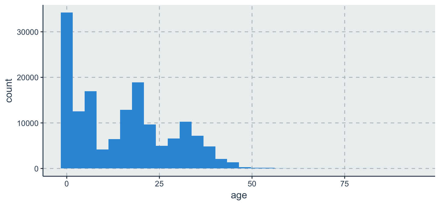
geom_histogram
data %>%
  ggplot(aes(x = age, y =..count..)) +
  geom_histogram()
Histogram
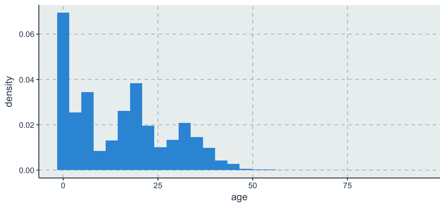
aes(y=..count..)vs.aes(y=..density..)
data %>%
  ggplot(aes(x = age, y =..density..)) +
  geom_histogram()
Histogram
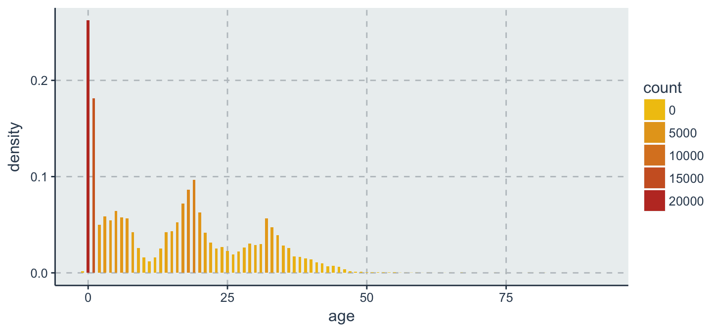
data %>%
  ggplot(aes(x = age, y =..density.., fill =..count..)) + # fill 依指定欄位填色
  geom_histogram(binwidth = .5)
Histogram + density
geom_histogram()+geom_density()
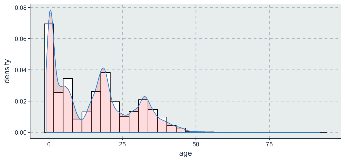
data %>%
  ggplot(aes(x = age, y = ..density..)) +
  geom_histogram(color = "black", fill = "white") +
  geom_density(alpha = .2, fill = "#FF6666") # alpha設定透明度
量化 v.s. 量化:Scatter Plot
Scatter plot
geom_point
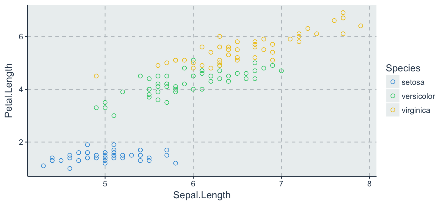
iris %>%
  ggplot(aes(x = Sepal.Length, y = Petal.Length, color = Species)) +
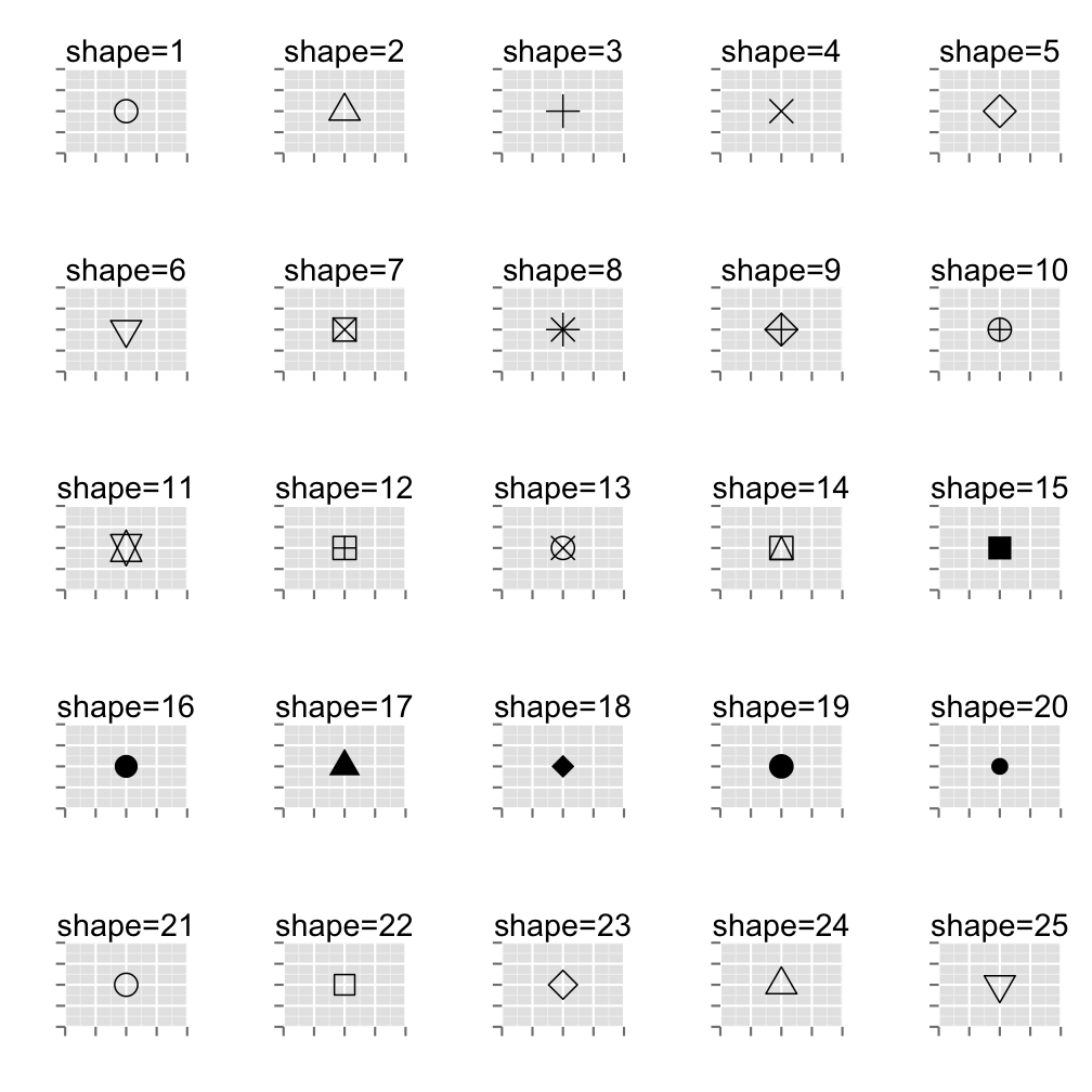
  geom_point(shape = 1, size = 2) # shape控制圖示;size控制點的大小
point shape types in ggplot2
Scatter plot
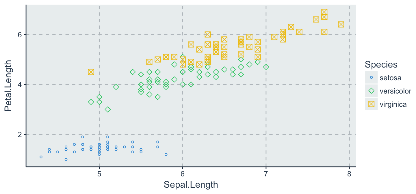
- 參數放在 aes() 函數裡面,表示資料依據指定欄位內容做不同的shape/size變化
iris %>%
  ggplot(aes(x = Sepal.Length, y = Petal.Length, color = Species, shape = Species, size = Species)) +
  geom_point() + scale_shape_manual(values = c(1,5,7)) +  # 控制 shape 顯示圖示
  scale_size_manual(values = c(1,2,3))   # 控制圖示 size 顯示大小
插播
install.packages("devtools")
小挑戰
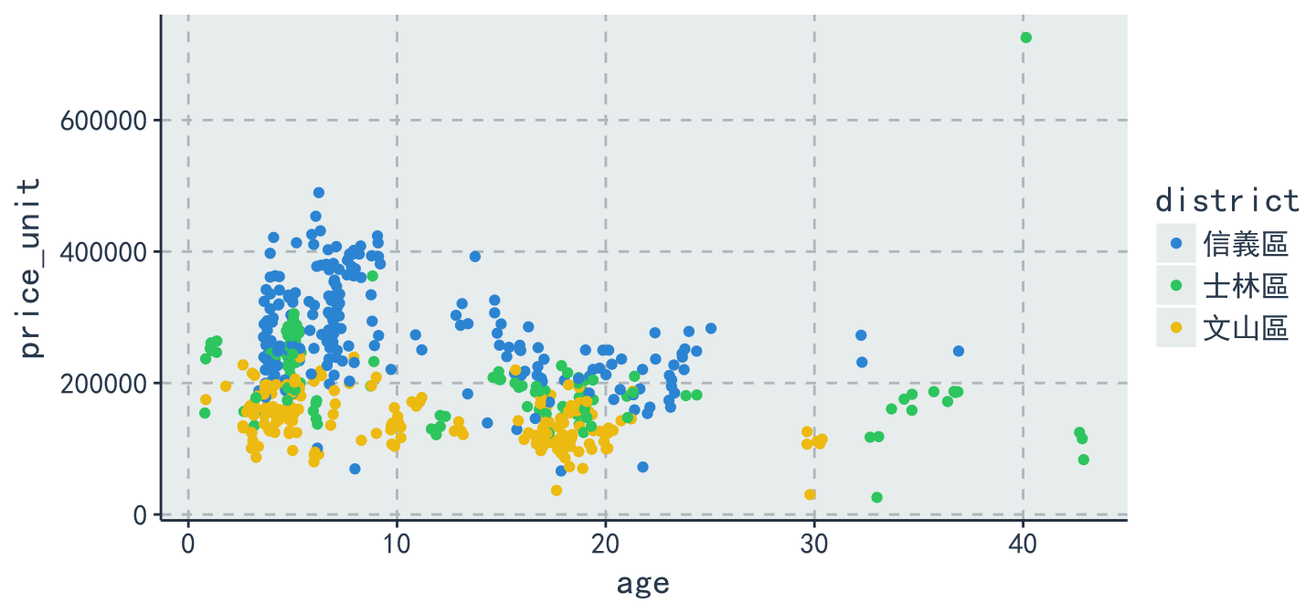
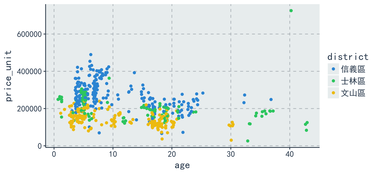
- 士林區,文山區,信義區三個區域的套房(1房1廳1衛)在屋齡與每平方公尺單價存在著怎樣的特性?
參考答案
library(ggthemr)
ggthemr('flat')
ans = data %>% filter(district == "文山區" | district == "士林區" |district == "信義區") %>% filter(build_type == "套房(1房1廳1衛)") %>% ggplot(aes(x = age, y = price_unit, color = district)) + geom_point(position = "jitter") + thm()
ans
HeatMap
相關性熱圖
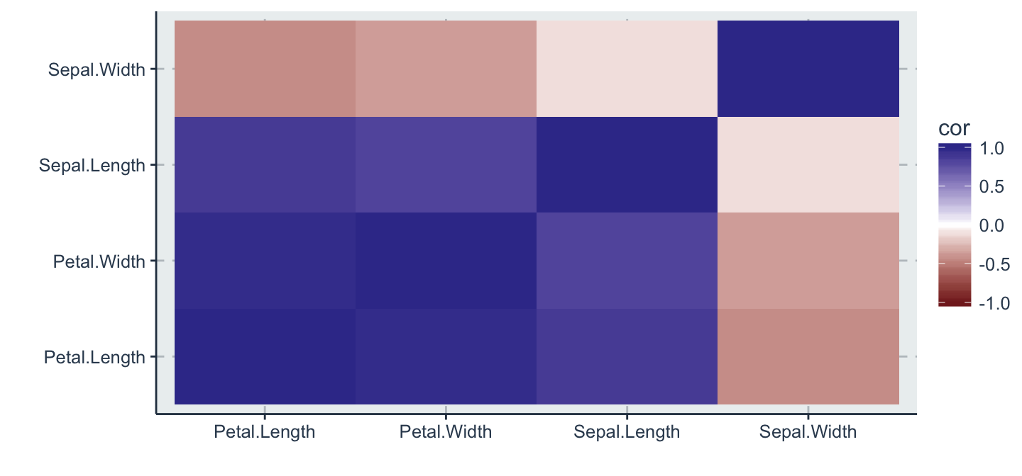
- 通常我們會好奇變數與變數之間是不是存在著相關性
- 在統計學上有一種簡單的方式去計算變數間的關係指標,我們稱之為相關係數係數!
- 以下將以 iris 資料做為示範,用熱圖來呈現
# 挑出前四欄位
dat <- iris %>%
  select(1:4)
dat %>%
  head()
  Sepal.Length Sepal.Width Petal.Length Petal.Width
1          5.1         3.5          1.4         0.2
2          4.9         3.0          1.4         0.2
3          4.7         3.2          1.3         0.2
4          4.6         3.1          1.5         0.2
5          5.0         3.6          1.4         0.2
6          5.4         3.9          1.7         0.4
寬轉長 計算相關性
p = dat %>%
  cor() %>%
  as.data.frame() %>%
  mutate(names = row.names(.)) %>%
  gather(class, cor, 1:4)
p %>% head(10)
          names        class   cor
1  Sepal.Length Sepal.Length  1.00
2   Sepal.Width Sepal.Length -0.12
3  Petal.Length Sepal.Length  0.87
4   Petal.Width Sepal.Length  0.82
5  Sepal.Length  Sepal.Width -0.12
6   Sepal.Width  Sepal.Width  1.00
7  Petal.Length  Sepal.Width -0.43
8   Petal.Width  Sepal.Width -0.37
9  Sepal.Length Petal.Length  0.87
10  Sepal.Width Petal.Length -0.43
Heatmap的好處
- 藉由 Heatmap ,快速地看出變數之間的關聯程度
p %>%
  ggplot(aes(x = names, y = class, fill= cor)) +
  geom_tile() + labs(x = "", y = "") +
  scale_fill_gradient2(limits = c(-1, 1))
進階技巧
statistics
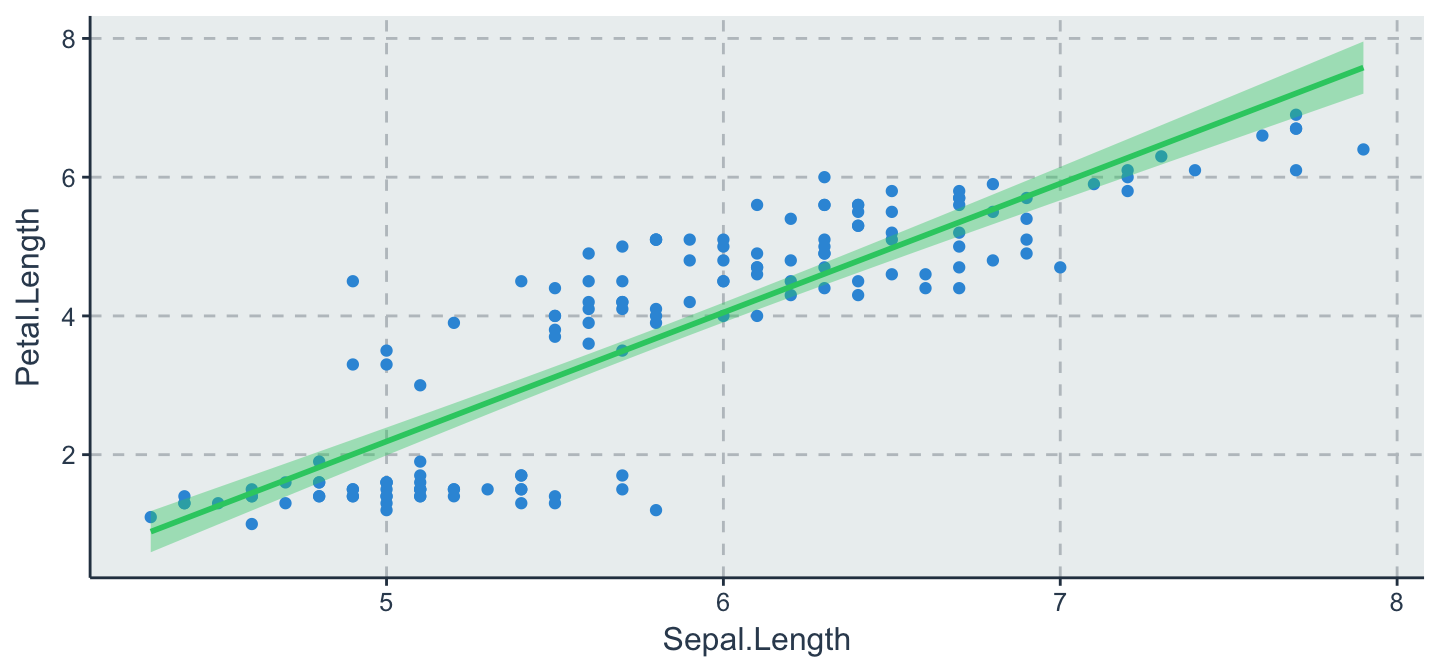
- Fit regression line
library(ggthemr)
ggthemr('flat')
iris %>%
  ggplot(aes(x = Sepal.Length, y = Petal.Length)) +
  geom_point() +
  stat_smooth(method = lm, level = .95) # add se=FALSE to disable CI
facet
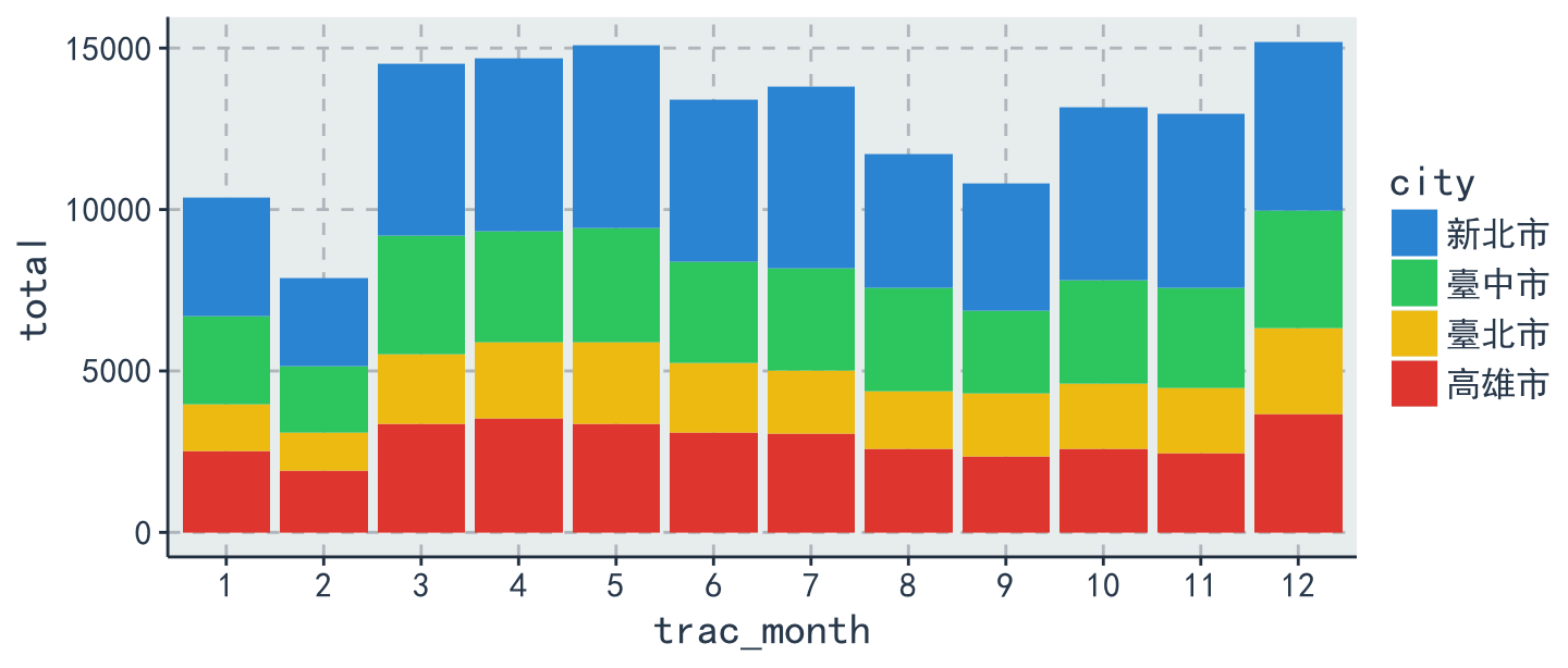
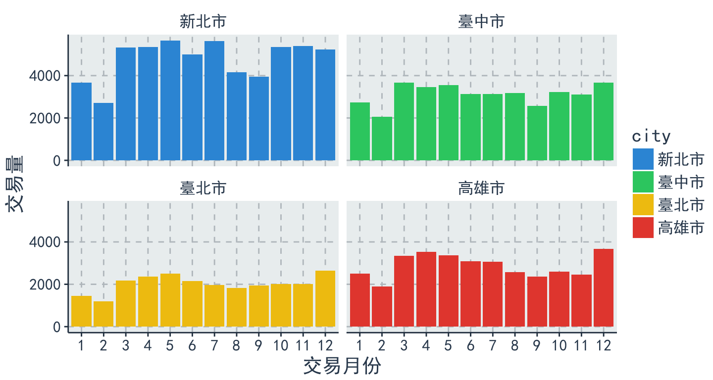
- 比較各縣市在各月份下的交易量
table <- data %>%
  group_by(city, trac_month) %>% # 選擇縣市、交易月份作為分群
  summarise(total = n()) # 計算分群下的總數
table %>%
  ggplot(aes(x = trac_month, y = total ,fill = city))+
    geom_bar(stat = 'identity') + thm()
facet
table %>%
  ggplot(aes(x = trac_month, y = total ,fill = city))+
    geom_bar(stat = 'identity') + thm() +
    facet_wrap( ~city , nrow = 2) +
    labs(x = "交易月份", y="交易量")
coord_flip()
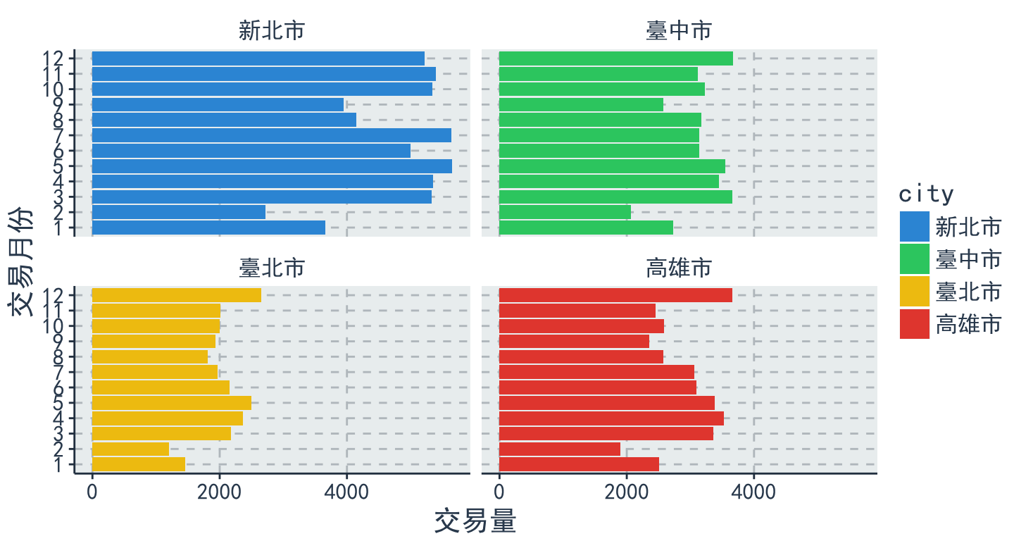
table %>%
  ggplot(aes(x = trac_month, y = total, fill = city)) +
  geom_bar(stat = 'identity') + thm() + facet_wrap( ~ city, nrow = 2)+
  labs(x = "交易月份", y = "交易量") + coord_flip()
圖形輸出
- 利用 RStudio UI 介面存擋
- 畫完圖之後,再存檔
ggsave('檔案名稱')
ggsave("plot.pdf", width = 4, height = 4)
ggsave("plot.png", width = 4, height = 4, dpi = 300)
互動式視覺化呈現
package:Plotly
- Plotly是一個資料視覺化的R套件,以簡單的方式,讓資料能夠產生互動的效果。
- 提供一個合作平台,使用者能夠將自己在R中繪製的圖存上屬於自己的Plotly平台上。
- Plotly官方網站
- 結合了各式各樣的API,包裝
Python、R、Malab、…等等
- 當然~ggplot2也能夠輕易地使用plotly轉換成互動式的圖表!!
套件安裝
- 直接從
CRAN內下載
# Plotly is now on CRAN!
install.packages("plotly")
# install the latest development version (on GitHub) via devtools
或是從github上下載,但前提是先安裝devtools
# install.packages("devtools")
devtools::install_github("ropensci/plotly")
- 安裝完,一樣別忘了要
library!
library(plotly)
plot with ggplot2
- 剛剛的小挑戰!?
ans = data %>%
  filter(district == "文山區" | district == "士林區" |district == "信義區") %>%
  filter(build_type == "套房(1房1廳1衛)") %>%
  ggplot(aes(x = age, y = price_unit, color = district)) + geom_point(position = "jitter") +
  thm()
ans
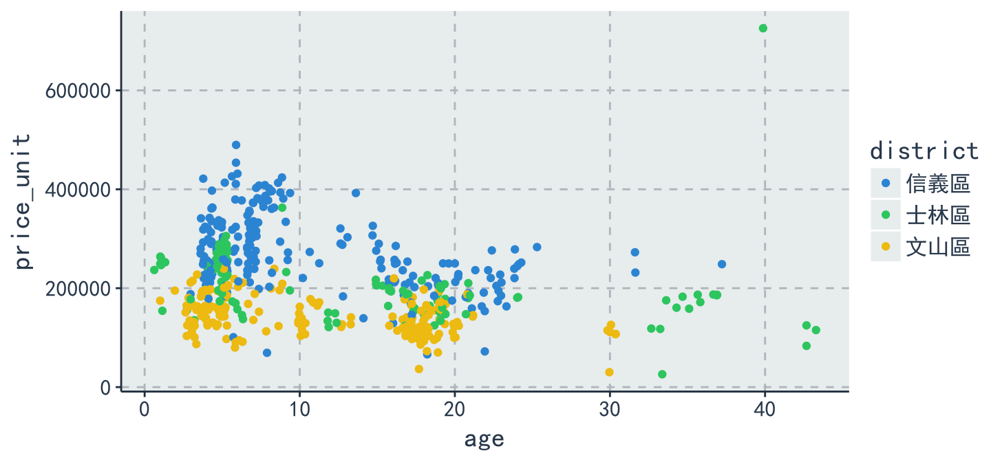
plot with ggplotly & Resize
- 是不是非常簡單?!
ggplotly(ans, height = 400, width = 1000)
學習資源
掌握心法後,如何自行利用 R 解決問題
了解自己的需求,詢問關鍵字與函數
歡迎來信 leslie.li@dsp.im 與我一起交流!
本週作業
請同學完成R語言翻轉系統以下章節:
必修
03-RVisualization-03-ggplot2
選修
03-RVisualization-01-One-Variable-Visualization03-RVisualization-02-Multiple-Variables-Visualization03-RVisualization-04-Javascript-And-Maps
Thanks for listening